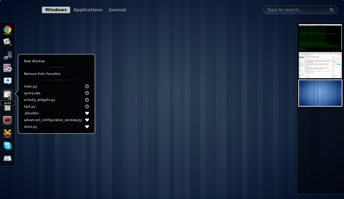
We have GNOME 3.0 now and it introduced a new overview mode. Now you can launch apps, switch between windows, and also managed virtual desktops. I loved it, and GNOME easily became my favorite desktop environment on any OS. But there are a few changes I would like to make and I can, this is one of the greatest about GNOME. You can change things to to your choice if you don’t like the default experience.
Here are a few was you can tweak the GNOME shell to suit your style.
1. Dash to Dock
The GNOME’s early criticisms was that the hassle of entering overview mode into doanything. Everything shifts when you wish to launch an app or just switch to a window in the background. If only the Dash were visible all the time. Dash is GNOME’s name for the dock visible in overview mode.
Dash to Dock can make this happen. The extension takes the Dash and makes it ever present.
2. Hide Top Bar
The Overview mode allows you to see everything on a single screen. This also includes the time and status indicators. Do you really need that information always on display in a panel?
Maybe you do. Many people like seeing the time and remaining battery life once in a while. Others prefer to remove such distractions and see only what they are working on. This extension will really help them out.
3. No Topleft Hot Corner
Hovering your cursor on the top left corner of the screen brings you to the overview mode. So does accidentally nudging against that area when all you want to do is hit the back arrow in Firefox instead.
If you happen to activate the hot corner by mistake more often, you will be happy to know that you can stop this behavior for good. And also you can still bring up the overview mode anytime by clicking Activities or by pressing the Super key. Once you have this extension, you’re free. There is nothing more to this than that.
4. Hide Dash X
My preferred approach is to remove the Dash completely. Instead of clicking on apps to launch them, I choose to search for them and press enter. By removing the icons I focus less on the open apps and more on open windows and what is in each virtual desktop.


